Exposed Drop-down Menu With Material Design 3

Menu
Menus display a list of choices on temporary surfaces. They appear when users interact with a button, action, or other control. Menus allow users to make a selection from multiple options. They are less prominent and take up less space than selection controls, such as a set of radio buttons.
There are two types of menu Material Design 3 provide
- Dropdown menus
- Exposed dropdown menu
Dropdown menus
This type of menu is used to display a list of options, triggered by an icon, button, or action. Their placement varies based on the element that opens them.
Exposed dropdown menu
This type of menu is used to display the currently selected menu item above a list of options. Some variations can accept user-entered input.
In this post we will learn how to create Exposed Drop-down Menu With Material Design 3
Read also How to use Toast and Snackbar
Steps
Create a New Project named as Exposed Dropdown Menu
Create a Layout named exposed_menu
Layout XML
layout/activity_main.xml
<?xml version="1.0" encoding="utf-8"?>
<androidx.constraintlayout.widget.ConstraintLayout
    xmlns:android="http://schemas.android.com/apk/res/android"
    xmlns:app="http://schemas.android.com/apk/res-auto"
    xmlns:tools="http://schemas.android.com/tools"
    android:layout_width="match_parent"
    android:layout_height="match_parent"
    tools:context=".MainActivity">

    <com.google.android.material.textfield.TextInputLayout
        style="@style/Widget.MaterialComponents.TextInputLayout.OutlinedBox.ExposedDropdownMenu"
        android:layout_width="match_parent"
        android:layout_height="wrap_content"
        android:layout_margin="20dp"
        app:layout_constraintLeft_toLeftOf="parent"
        app:layout_constraintRight_toRightOf="parent"
        app:layout_constraintTop_toTopOf="parent">

    <com.google.android.material.textfield.MaterialAutoCompleteTextView
        android:id="@+id/autoCompleteTextView"
        android:layout_width="match_parent"
        android:layout_height="match_parent"
        android:layout_weight="1"
        android:inputType="none"
        android:text="@string/choose_state" />
    </com.google.android.material.textfield.TextInputLayout>

</androidx.constraintlayout.widget.ConstraintLayout>
MainActivity
MainActivity.kt
package com.example.exposeddropdownmenumdc

import androidx.appcompat.app.AppCompatActivity
import android.os.Bundle
import android.widget.ArrayAdapter
import android.widget.AutoCompleteTextView

class MainActivity : AppCompatActivity() {
    override fun onCreate(savedInstanceState: Bundle?) {
        super.onCreate(savedInstanceState)
        setContentView(R.layout.activity_main)

        val languages = resources.getStringArray(R.array.America)
        val arrayAdapter = ArrayAdapter(this, R.layout.exposed_menu_item, languages)
        val autocompleteTV = findViewById<AutoCompleteTextView>(R.id.autoCompleteTextView)
        autocompleteTV.setAdapter(arrayAdapter)
    }
}
Exposed Menu Item Layout
exposed_menu_item.xml
<?xml version="1.0" encoding="utf-8"?>
<com.google.android.material.textview.MaterialTextView
    android:id="@+id/textView"
    xmlns:android="http://schemas.android.com/apk/res/android"
    android:layout_width="match_parent"
    android:textStyle="bold"
    android:textColor="@color/black"
    android:padding="14dp"
    android:text="TextView"
    android:layout_height="wrap_content">
</com.google.android.material.textview.MaterialTextView>
String
values/strings.xml
<resources>
    <string name="app_name">Exposed Dropdown Menu</string>
    <string name="choose_state">Choose A State</string>
    <string-array name="America">
        <item>California</item>
        <item>Florida</item>
        <item>Texas</item>
        <item>Hawaii</item>
        <item>Nevada</item>
        <item>South Carolina</item>
        <item>Washington</item>
        <item>West Virginia</item>
    </string-array>
</resources>
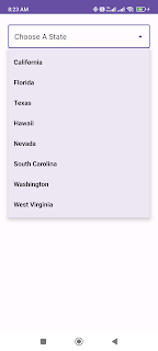
Output :


Read also Toggle button in Material Design 3
Thanks for reading!😊😊😊😊😊😊
If you enjoyed reading , Show some Love by clapping 👏 on this post!If you have any suggestion share with me.
0 Comments